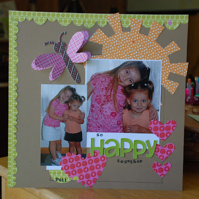
 My creation...
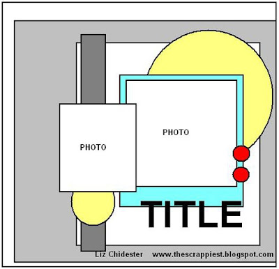
 When I use a sketch I don't use each piece so literally. For example, Liz drew a circle in the top right corner...I translated that to a sun for my layout...same basic shape but a little different. Also, when I first look at the sketch I see the light gray square and the smaller white square as layers on top of the background. However, I didn't use layers to interpret those pieces of the sketch. I added strips of green along the left and top and drew a smaller box on my background to interpret "layers" on the layout. The sketch had two small {red} circles for embellishments, I added three hearts. So we get inspired by a sketch but then we have to be creative in making it fit our layout or creative artwork.
Don't forget to add your layout to Lisa's previous post for a chance to win a RAK for her! I can't wait to see your interpretation!


super cute page heather! i'm using this sketch today!
ReplyDelete